Unlimited Creativity for Unstoppable Brands
Unobvious Creative Studio
Unlimited Creativity for Unstoppable Brands
Unobvious Creative Studio
“Our work is more than just a pretty picture. It should have value and impact, so it makes a difference. Therefore we love to team up with likeminded brands, so we can achieve positive change together.”
Below you will find a selection of our projects, brands and clients.
PORTFOLIO
CASE: KRUX BROUWWERF
KRUX Brouwwerf is a new Amsterdam based brewery on the eastern docklands. Unobvious incorporated the heritage of KRUX’ unique location in the identity and packaging of the smallest brewery in Amsterdam.
CASE: KRUX BROUWWERF
KRUX Brouwwerf is a new Amsterdam based brewery on the eastern docklands. Unobvious incorporated the heritage of KRUX’ unique location in the identity and packaging of the smallest brewery in Amsterdam.
overall concept
KRUX Brouwwerf produces fresh crafted beers, following their own recipies. Brewery, bar and terrace are located in and around one building, called Brouwwerf (Brew Wharf) at Cruquius Island in Amsterdam.
KRUX’ passion for beers and hard work shows similarities with the activities that took place on their location Cruquius Island, circa a hundred years ago. Cruquius Island was part of the Amsterdam docks, with cranes, factories, ships, warehouses and heavy labour. Unobvious suggested an overall concept for KRUX, that would be visualized from identity to packaging, and from merchandise to signing.
storytelling
The story of KRUX has to be visible in every vein of the brand. So after several sessions with the client, it was decided to tell the rich story of the location. The history of the area KRUX is located. The story of hard working people, steel, wood, concrete, shipyards, trade, cranes and craftmanship.


Images: © Stadsarchief Amsterdam
IDENTITY
Following the initial concept, the identity of KRUX has a strong industrial and rugged feel. The typography of the logo is constructed, just like the cranes you would find in earlier days at Cruquius Island. The illustration of the brewing tank is a reference to their main activity.


packaging
Typography and colour. That’s it. No unnecessary elements. Straight forward.
But ofcourse, all well considered and keeping the overall brand concept in mind.
The names of the KRUX beers originate from professions you would find at Cruquius Eiland, at the beginning of the twentieth century.

The font we used for the names of the beers, has a constructed look. Just like the steel construction works or cranes at the docklands. This font is vital for the identity of the packaging: the font is the key visual. So we chose a bold font, with strong expressiveness.
We chose the colours meticulously from colour cards from the 1920s, made by the paint factory that was located opposite of what is now KRUX Brouwwerf. We were inspired by these vintage coulours. We gratefully used them and expanded the range with matching and contrasting colours.

interior branding
In the interior, designed by interior designers Pubblik & Vos, we made sure the brand is obviously visible, while sitting and drinking at the brewery bar. The logo and slogan are part of the surroundings, with its industrial look and feel.


Images: © Mark Kuipers
Case: Balacron Covers
BN Covermaterials commissioned Unobvious to analyse and restructure their collection and create a new identity for the brand and product range. After investigating several options on how to arrange the catalogue (for instance by colour, by series, by texture, by look & feel, etc), the final result is a brand new collection box, containing four collections: Heritage, Spectrum, Atelier and Textile.
FOUR COLLECTIONS
Heritage shows all the classic colours and qualities, while Spectrum has a variety of bold and subtile colours. And while Atelier focusses on special textures, Textile shows the linen collection. We named the four collections as well as the specific colours. And we designed the index on the back, to get a quick overview of the separate series.


PACKAGING
The new collections are presented in four concertina catalogues, which are brought together in the collection box. We also designed the packaging of the catalogues and the box. Each catalogue has a cover design that represents a selection of the swatches that are inside the catalogue. But when the catalogues are placed in the box, the designs of the individual catalogues match together as one.


IDENTITY
We’ve designed the Balacron Covers logo that suits a high end covermaterials brand as well as their proposition “Solid, Timeless, Remarkable”
For the business cards, we thought it would be fun (and functional as well) to show a bit of the collection. So on each backside of a business card, you’ll find a swatch of the collection and the specifications. There are 8 different swatches, so you can collect them all.


PROMOTIONAL IMAGES
To inspire customers and designers on how the covermaterials can be used, we’ve also created some inspirational images. They can be used as visual content for the website, social media and brochures. So for each collection we designed 6 fake book covers. We’ve picked 6 covermaterials in colours that represent each collection and make an nice match together.
We’ve designed the covers as if they were real books. When the books are placed in the right order on the pile, you can read their titles on the spines as a sentence, finished by their slogan. For example: “Heritage, 74 Vinyl Colours and Qualities … Solid, Timeless, Remarkable”
The books were all made by a book binder, and after that we photographed the books as separate collections, as well as a whole. We’ve made a landscape composition of books and went through it with the camera from different angles. As if you are going trough a setting of giant books.


FAIR BOOTH
Finally we’ve designed the booth of the fair. The wall on the back features the new logo and a selection of swatches, referring to the design of the catalogues. On the left wall we present the four new collections by showcasing the books. While on the right side the two latest additions to the collections are being showed, the Liv and Rebel.


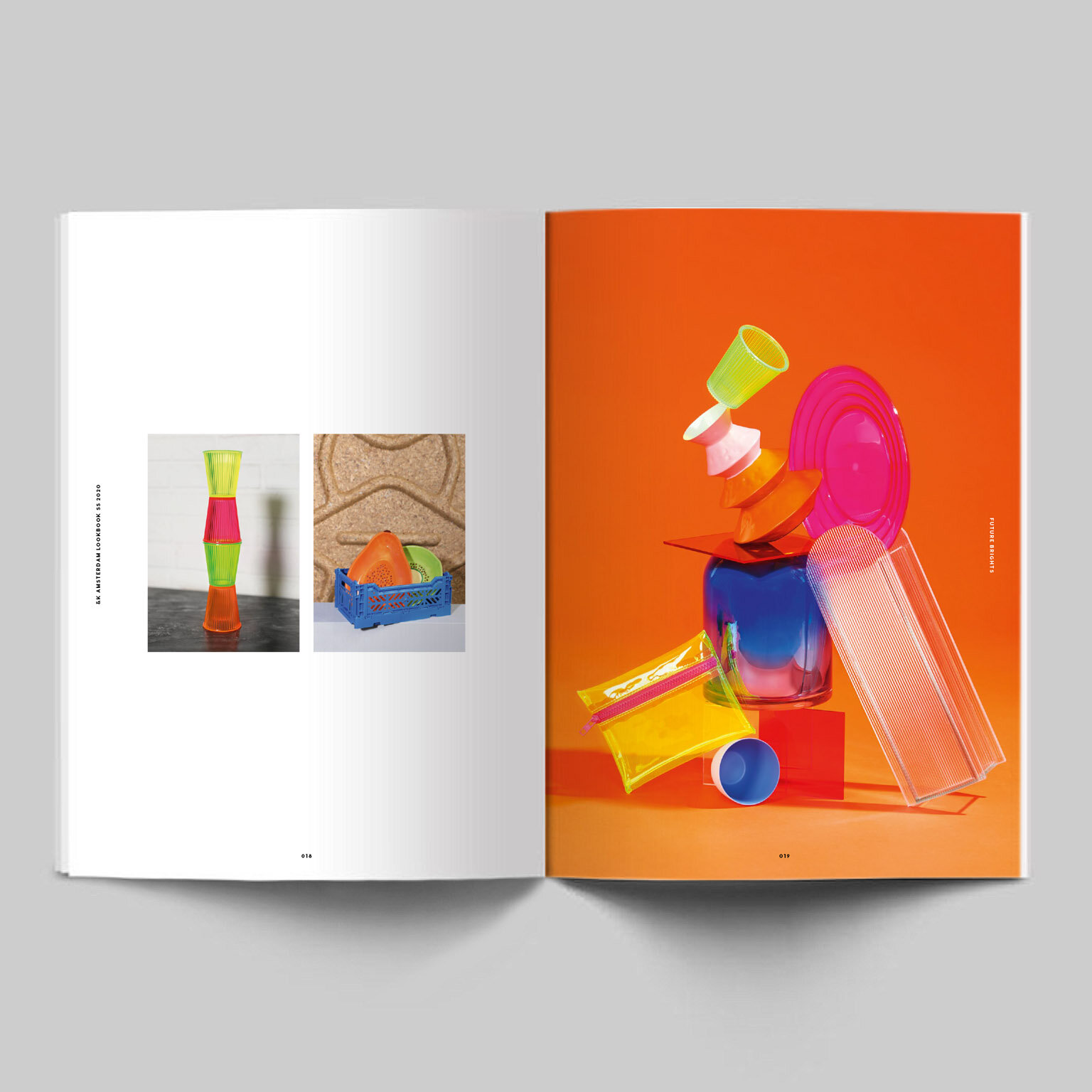
CASE: &k amsterdam
&k amsterdam – the brand that is characterised by creative, colourful home decorations and gifts – commissioned Unobvious to analyze and restructure their catalogue range, starting off with collection SS 2020.
CASE: &k amsterdam
&k amsterdam – the brand that is characterised by creative, colourful home decorations and gifts – commissioned Unobvious to analyze and restructure their catalogue range, starting off with collection SS 2020.
concept & design
Unobvious decided there should be a lookbook section which explains the new trends for the particular season, plus a separate catalogue section where retailers will find the whole range of &k products. We also gave the whole book a significant &k-branded design, giving the &k ampersand an important role in typography.
We executed the whole concept together with the team of &k and photographer Noortje Knulst and set designer Noortje de Keijzer. This resulted in a 292 pages thick, pocket sized colourful book that inspires and persuades customers to order from the &k amsterdam collection.
cover


lookbook


catalogue


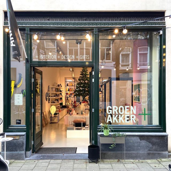
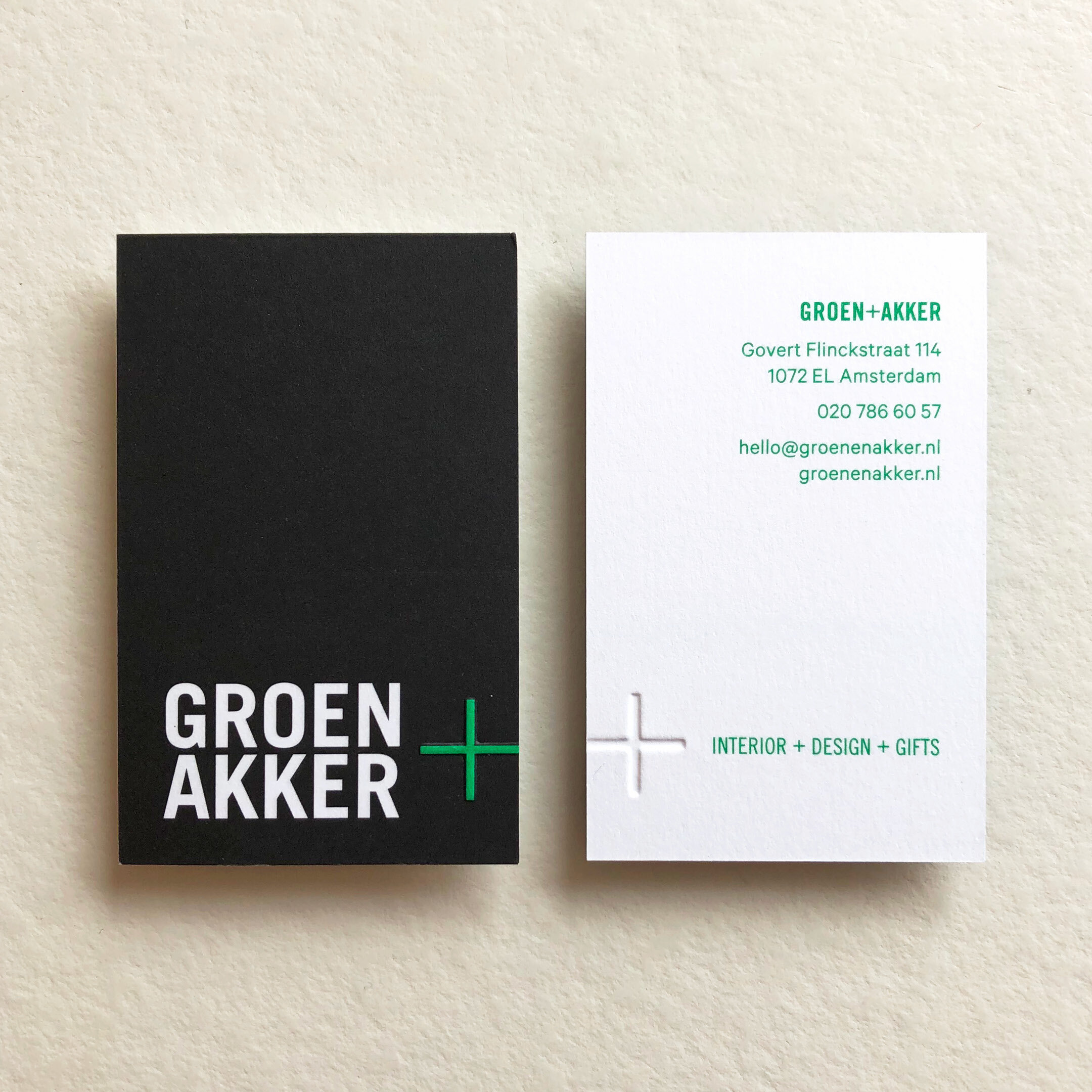
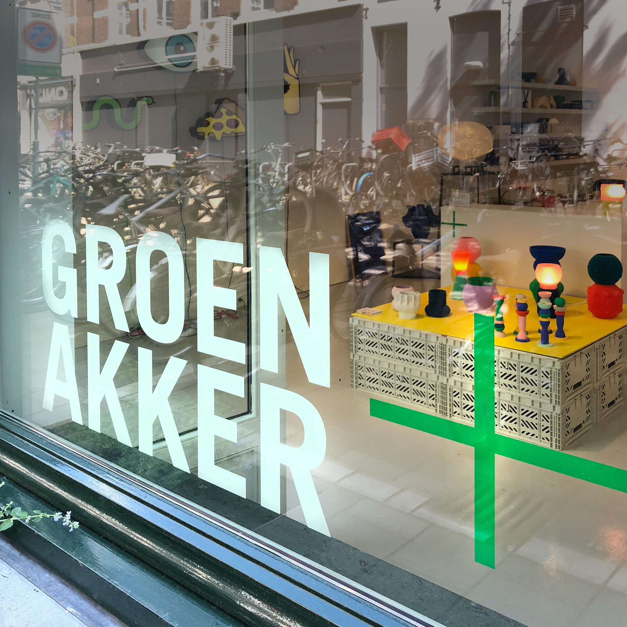
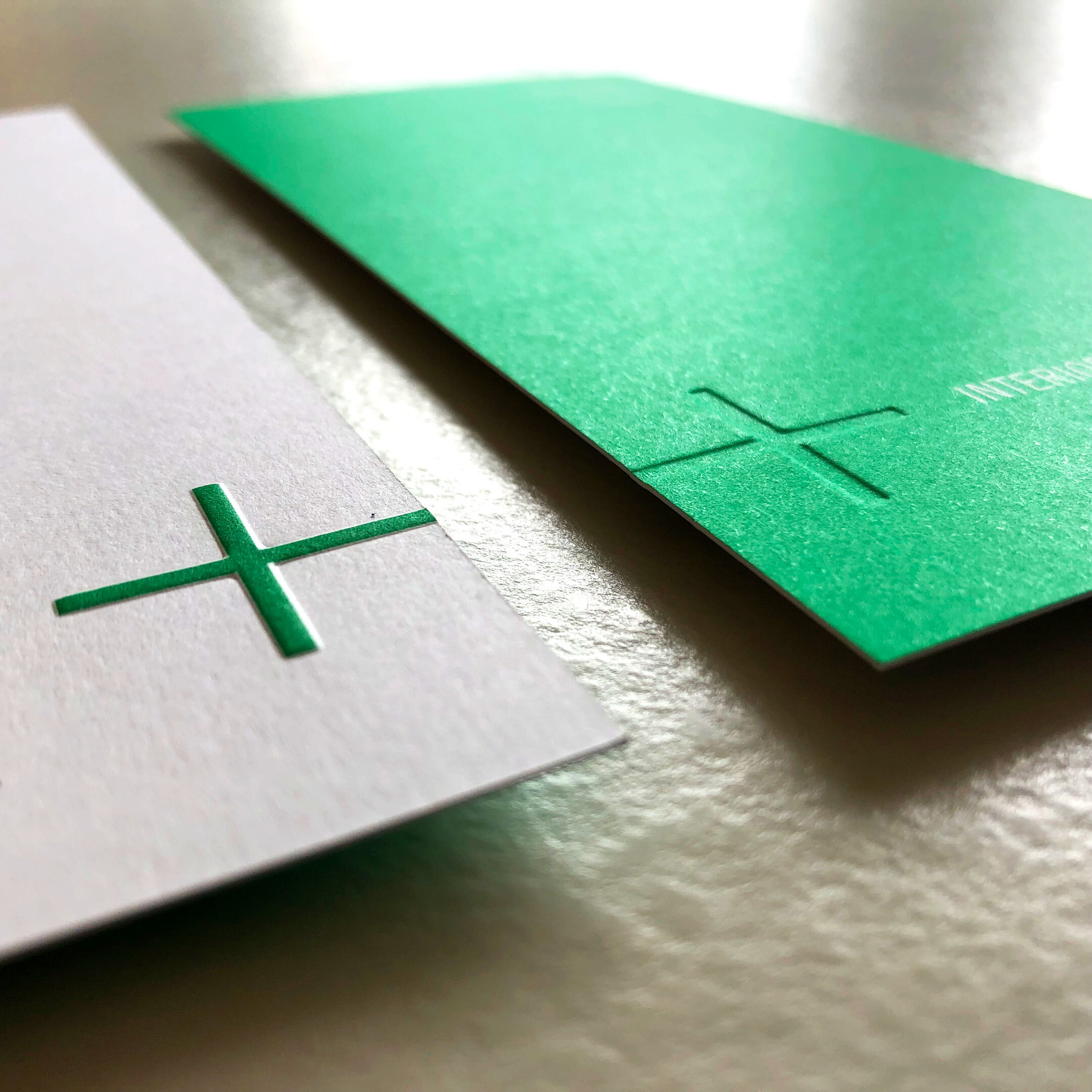
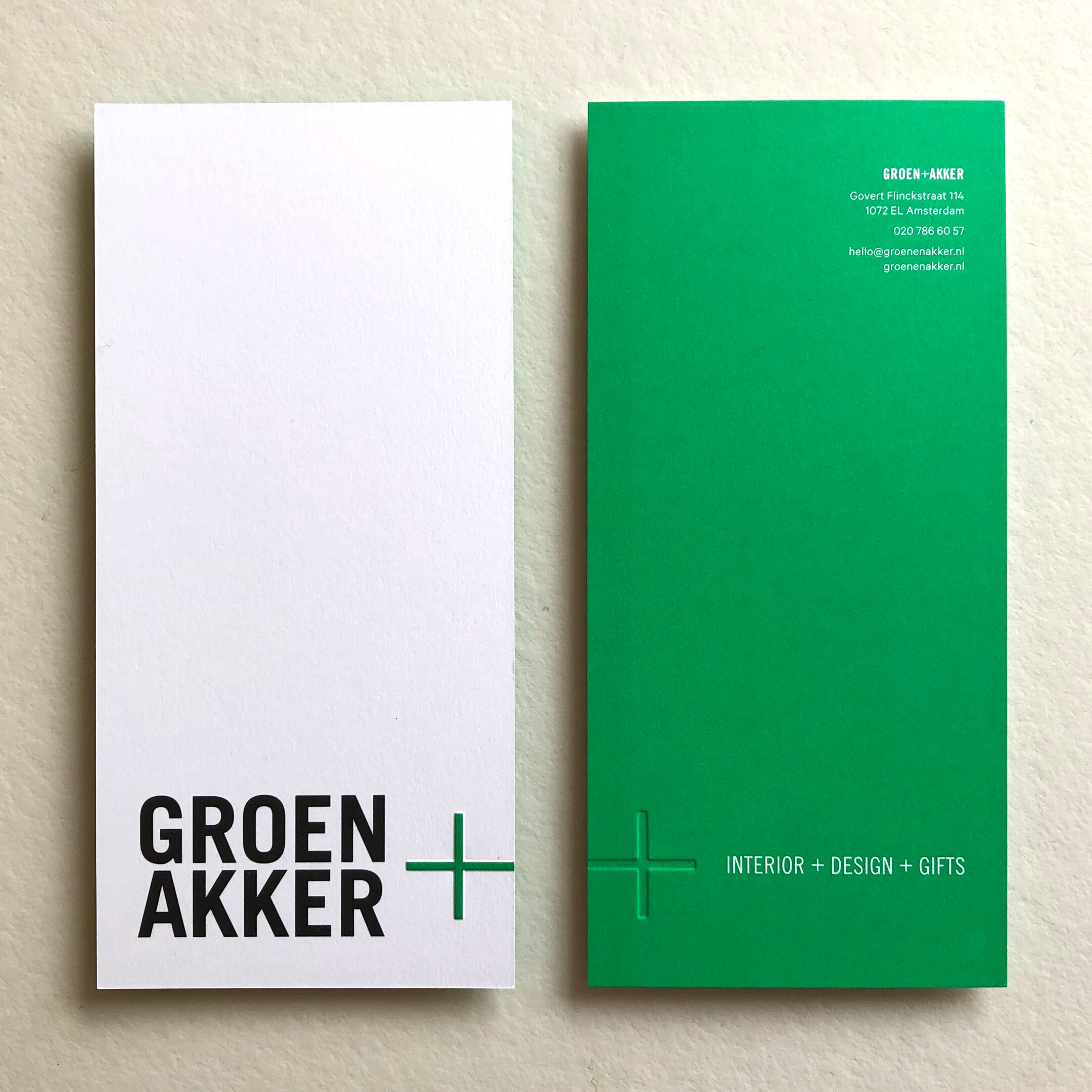
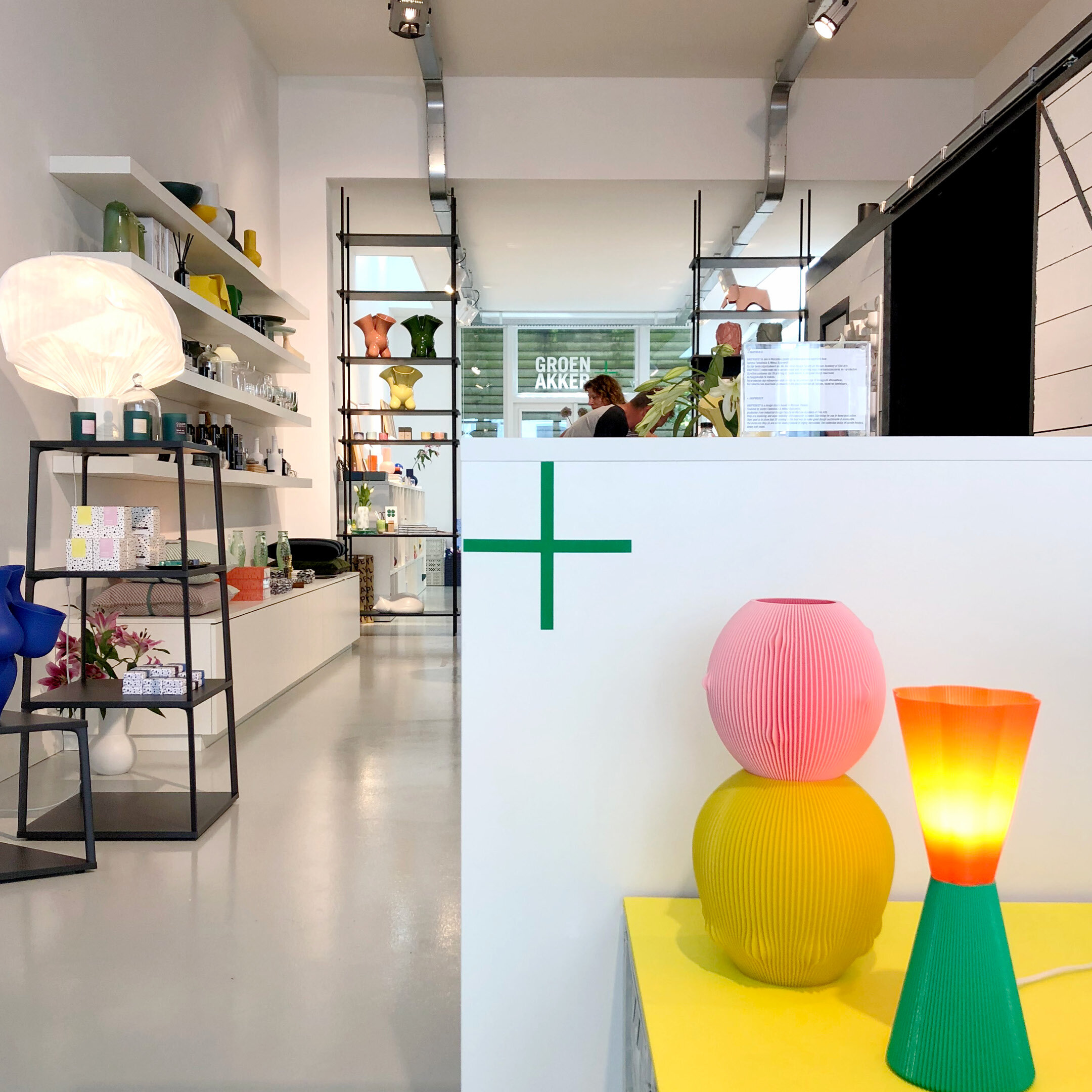
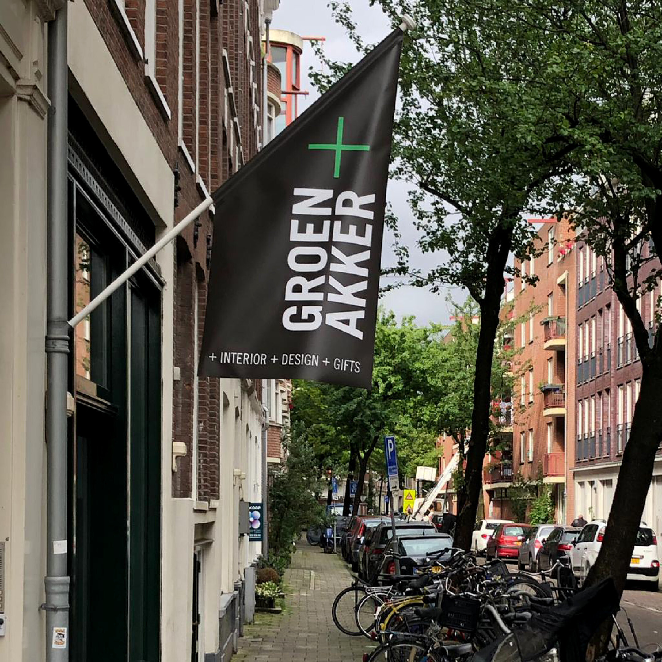
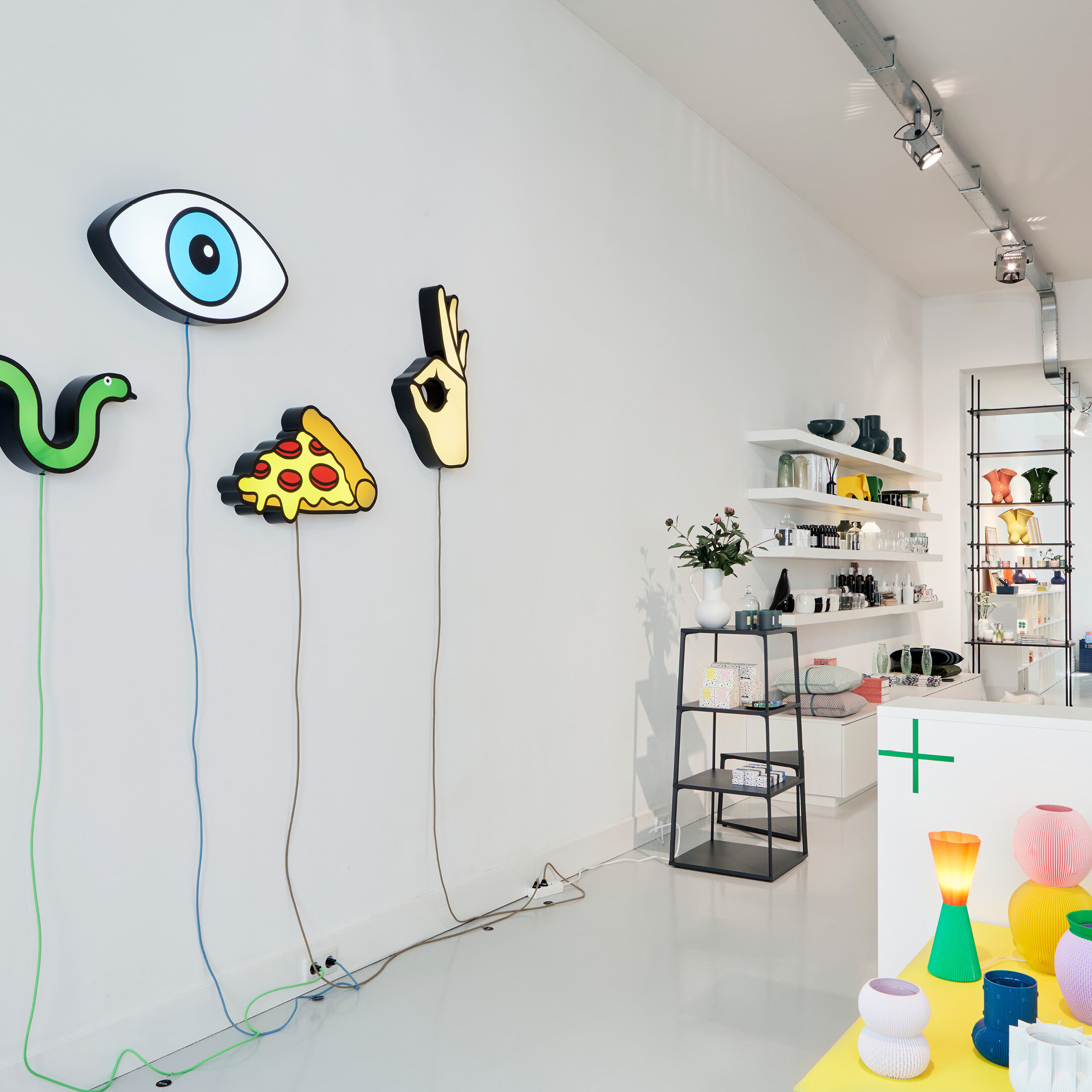
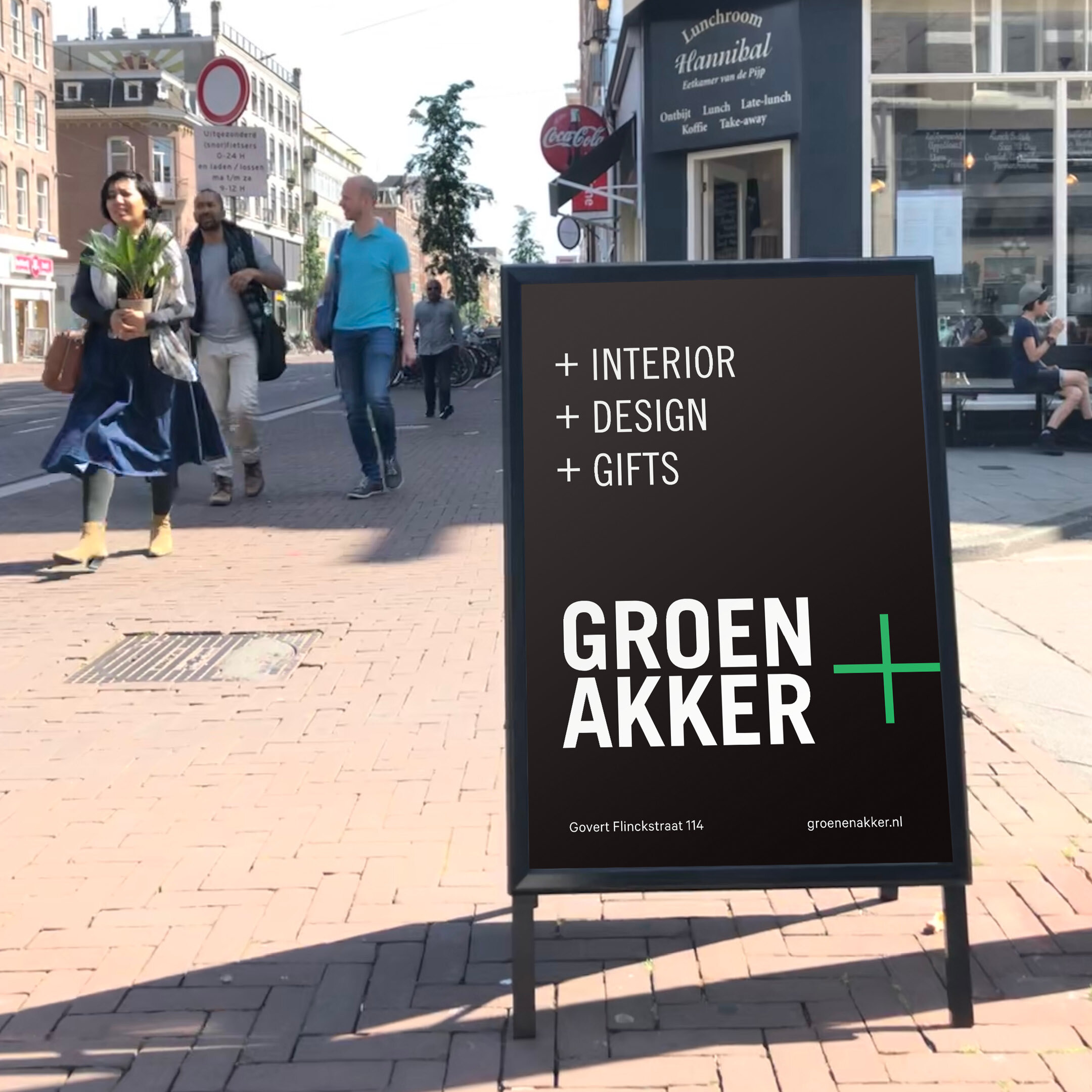
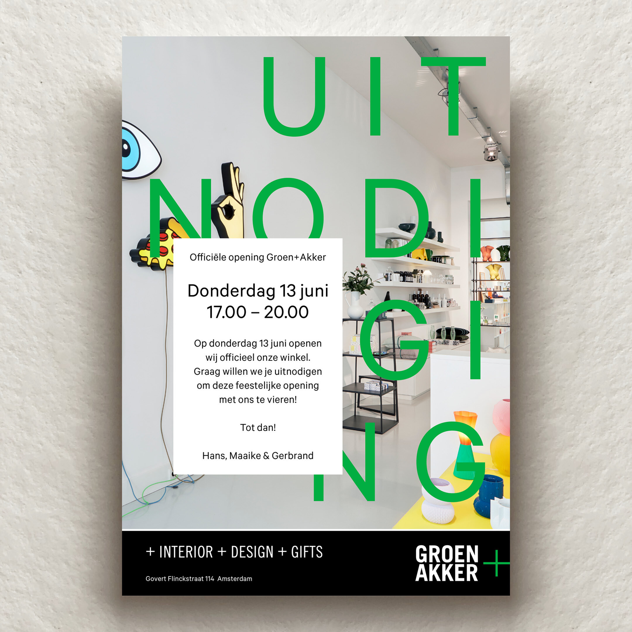
CASE: GROEN+AKKER
CASE: GROEN+AKKER
Green and fresh
Looking for a special gift or home accessories that go beyond the word "HOME" on your windowsill? Then be sure to check out Groen+Akker. A large part of their range is exclusively for sale at this home and gift shop. Every two months in the front part of the store there is a presentation by a young designer, an innovative brand or a designer collective.
Unobvious designed a timeless, clean and fresh identity for Groen+Akker, with a major role for the plus sign, which stands for the G+A team and their future collaborations with brands and designers. And of course for their plus in service and innovative look on design.
Always a PLUS at Groen + Akker.

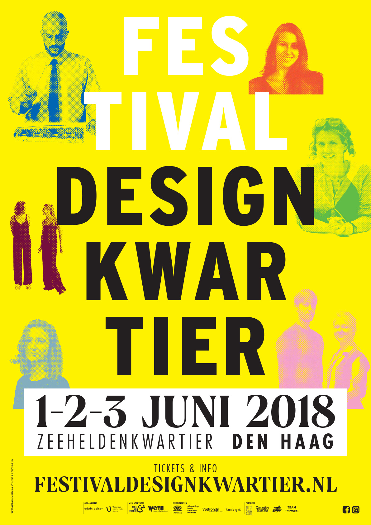
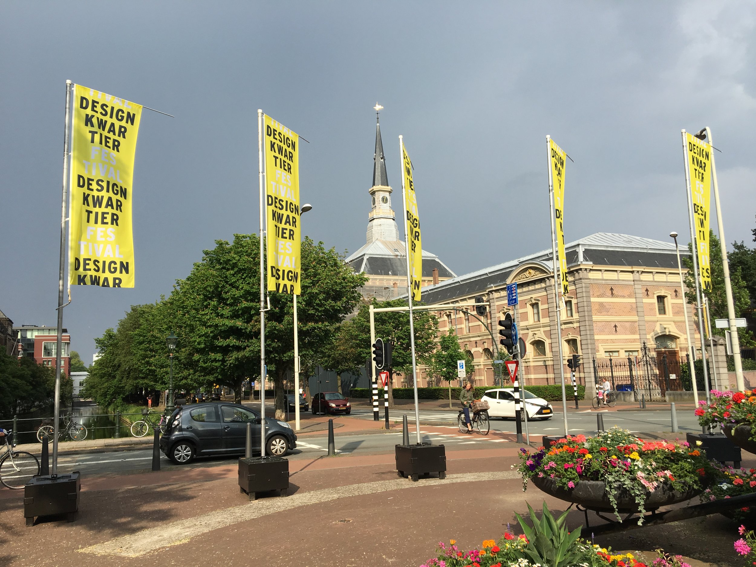
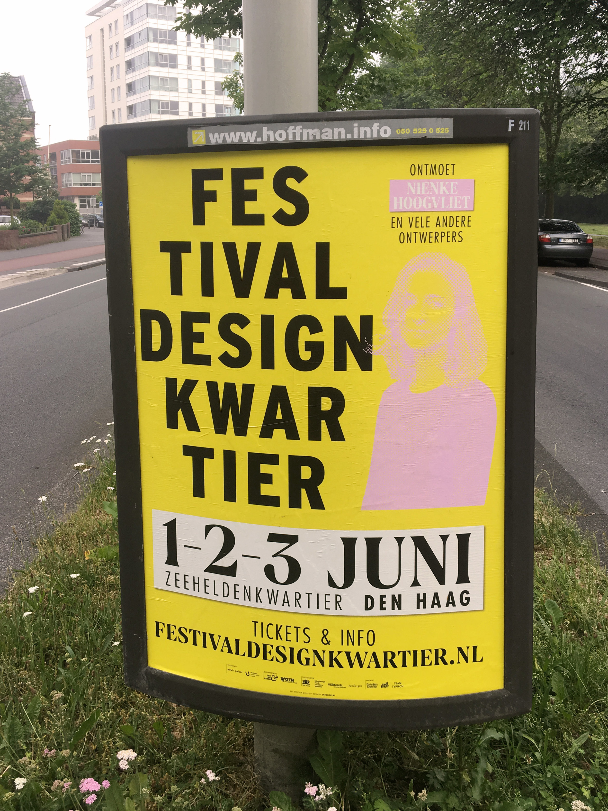
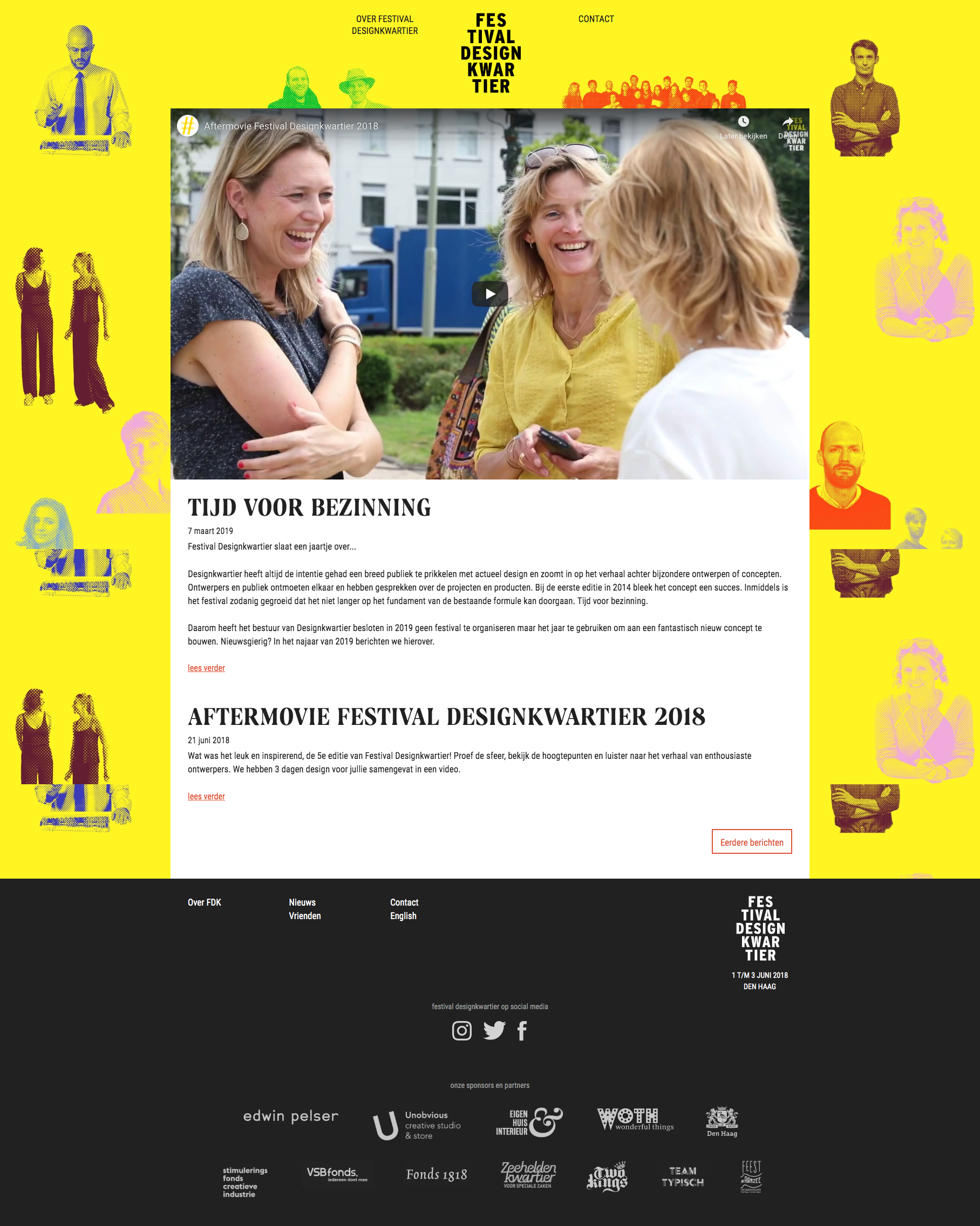
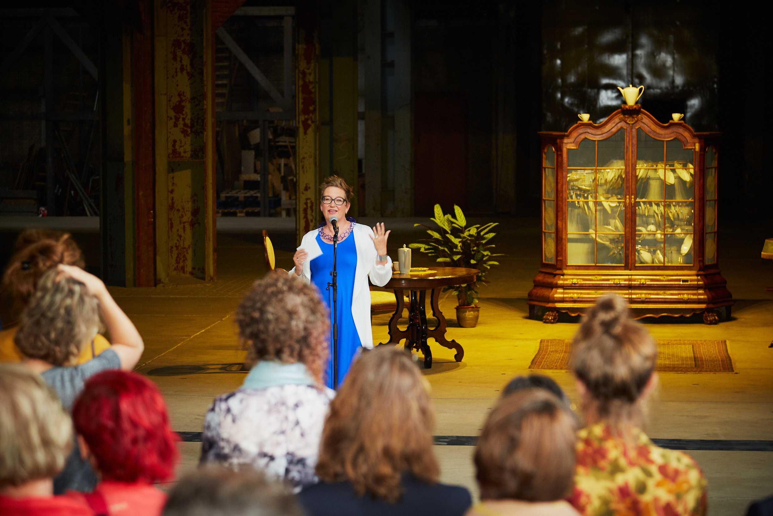
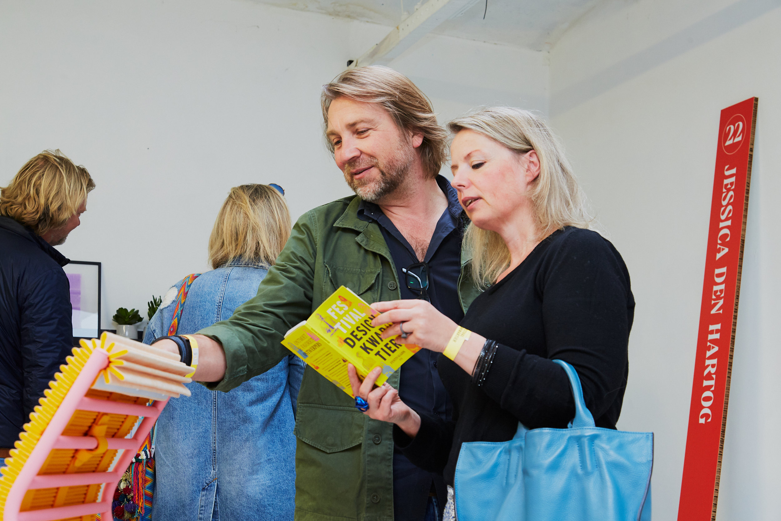
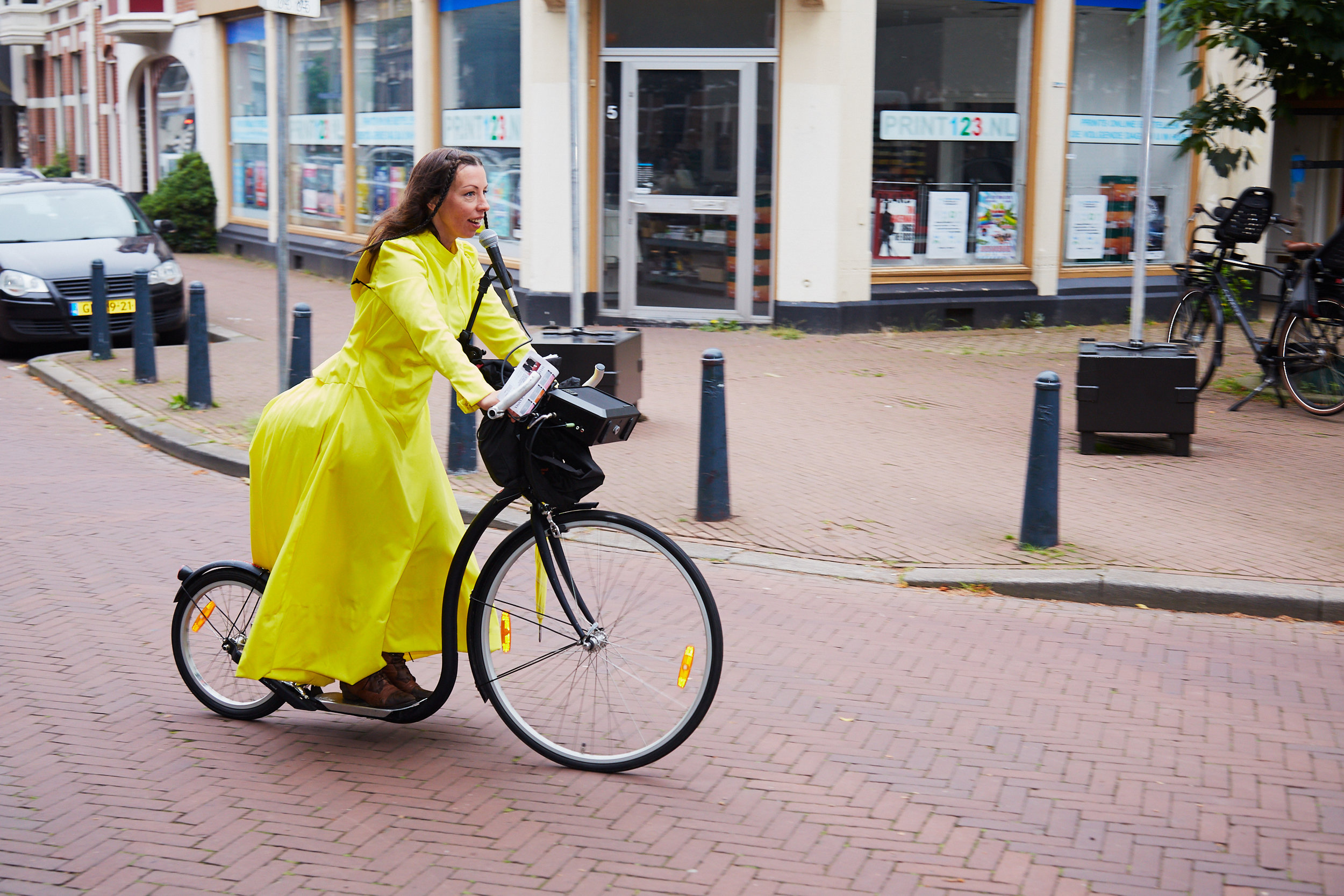
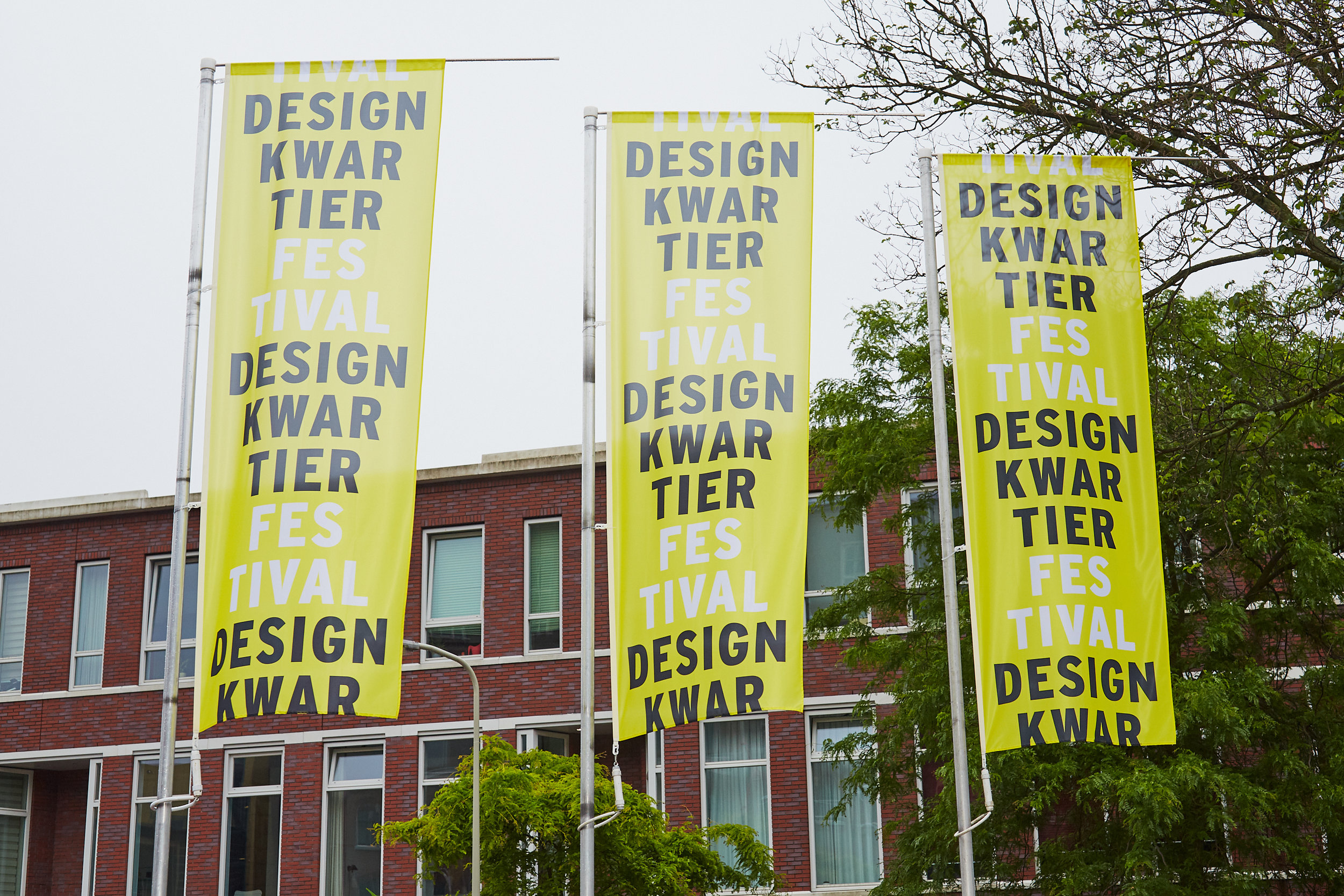
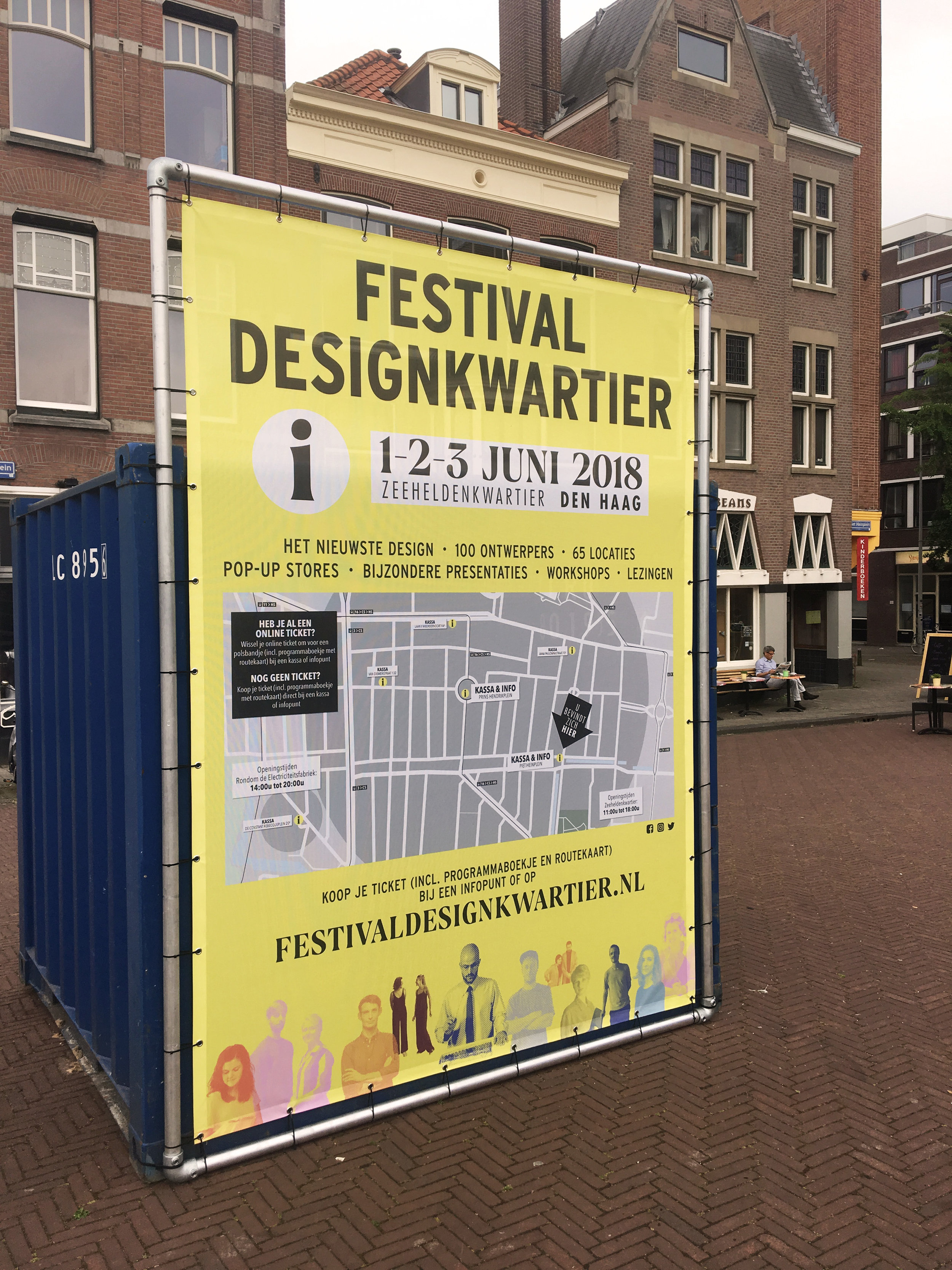
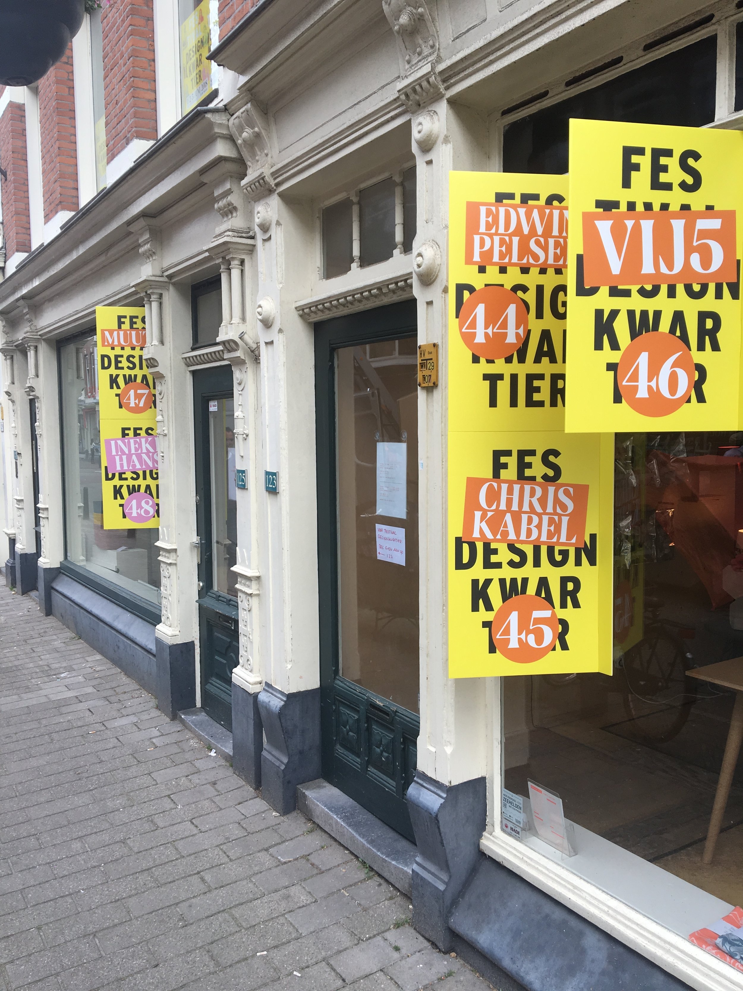
Case: Festival Designkwartier
festivaldesignkwartier.nl
Case: Festival Designkwartier
festivaldesignkwartier.nl
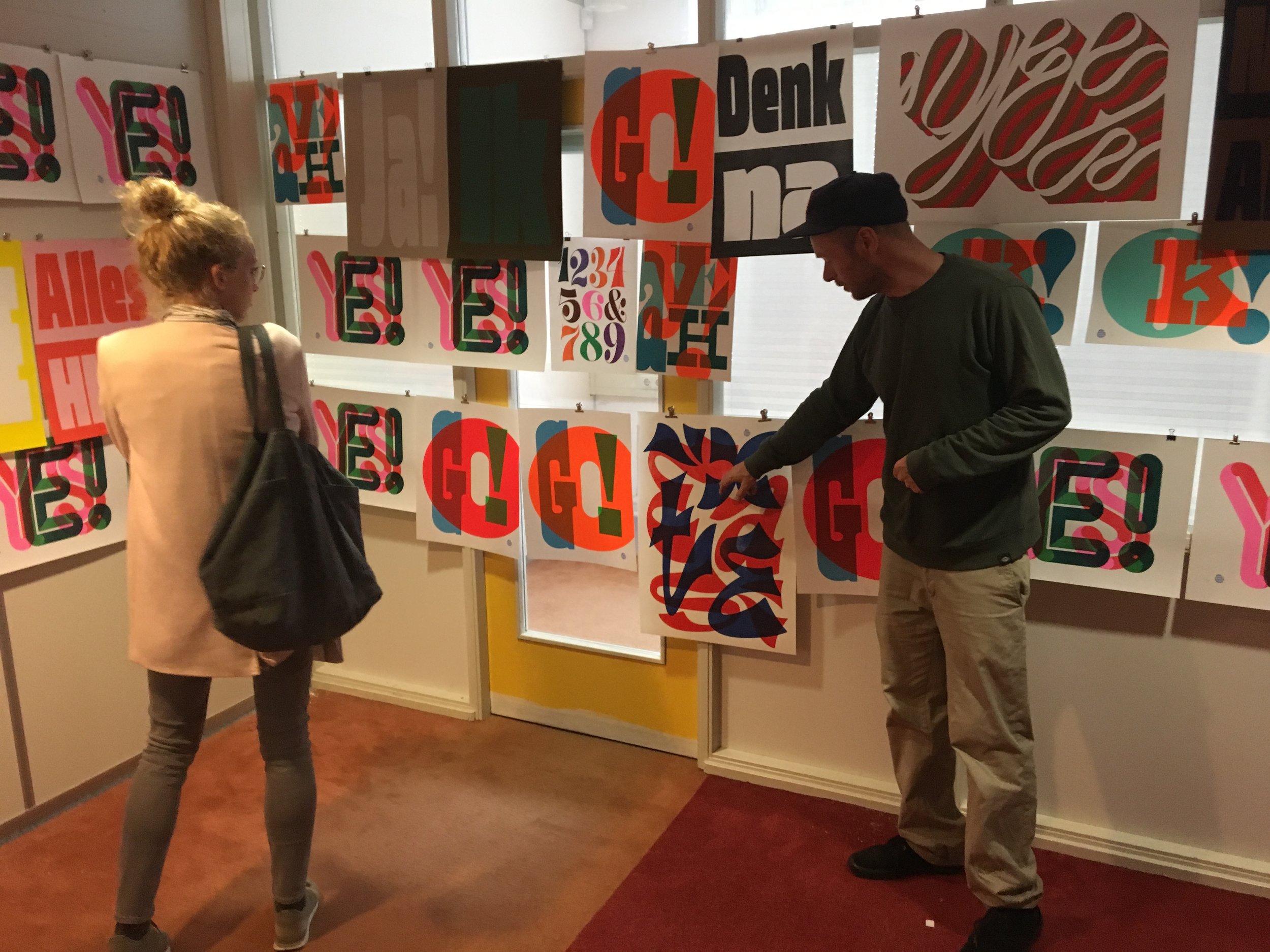
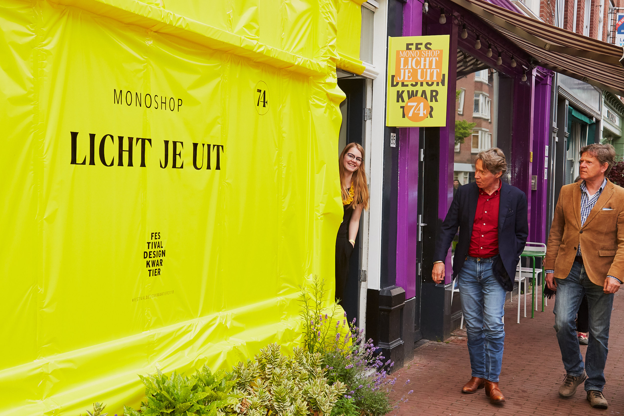
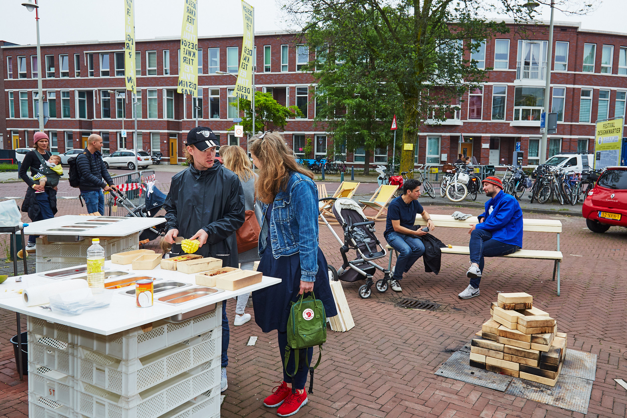
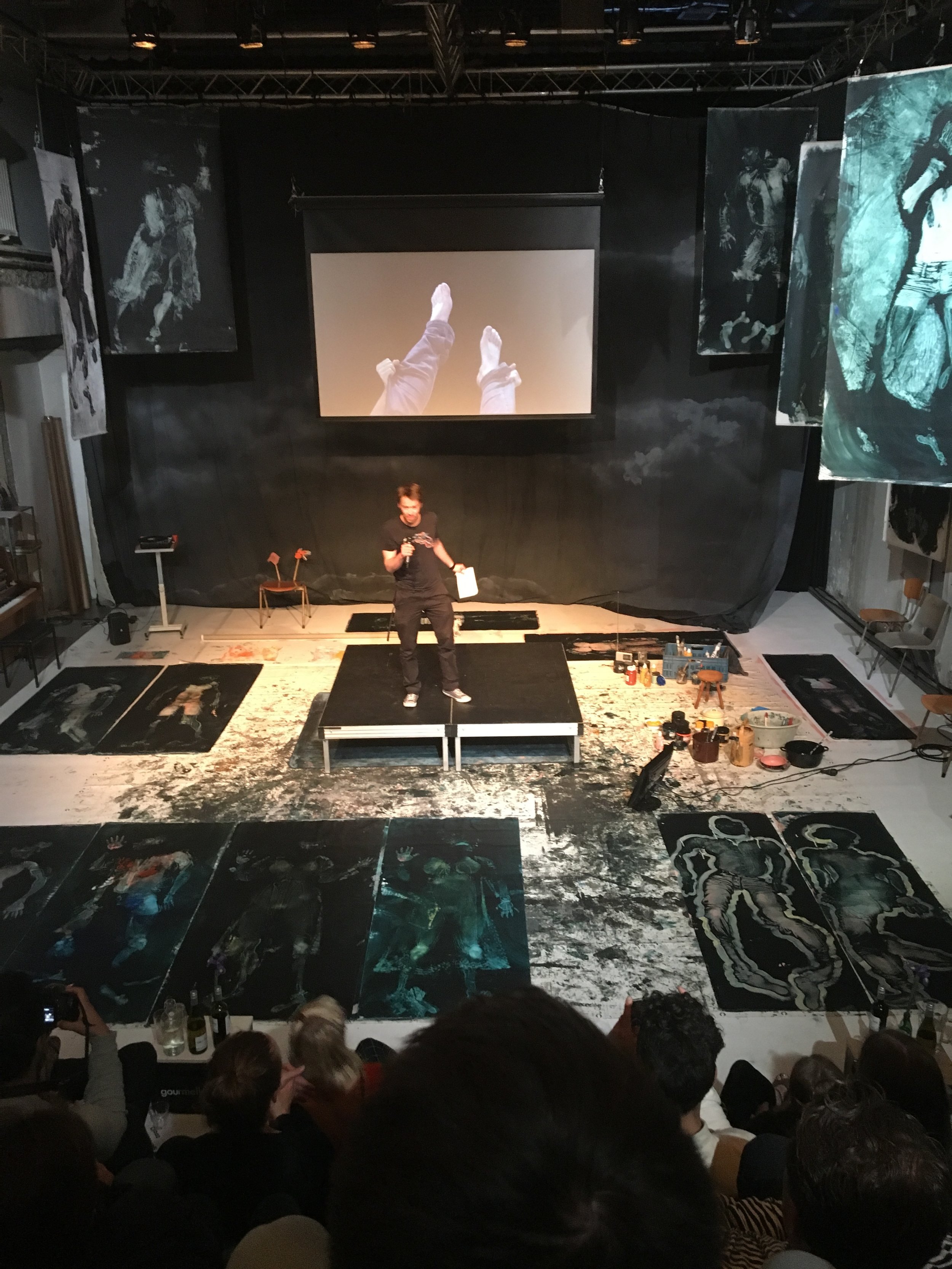
The 5th edition (2018) of Festival Designkwartier was organised by Creative Studio UNOBVIOUS and Edwin Pelser. UNOBVIOUS also did the branding and design. The festival is an initiative of Foundation designkwartier Den Haag.
Festival Designkwartier mixes presentations, shops, activities, and exhibitions in the design field into an inspiring event. For three days, the Zeeheldenkwartier is the domain of leading designers and new talent with exciting projects. Over 100 (Dutch) designers were presented in about 80 locations in the Zeeheldenkwartier in The Hague.
CASE: Adriaan Brouwer
Your Own Story
CASE: Adriaan Brouwer
Your Own Story
visual identity
Personal and Career Coach Adriaan Brouwer asked Unobvious to create a visual identity that would be different from imagery that is often used in the visual identities for coaching practices, like balancing stones, or a calm view of the horizon. Adriaan wanted a bold and uplifting look that matches his character and style of coaching. He was looking for an imaginary dreamworld, that would pull people into the his world like an illustrated children’s book. And in stead of focussing on finding your balance, Adriaan’s style of coaching is all about telling “your own story”.
three phases
So we came up with a concept around telling YOUR OWN STORY (“Je eigen verhaal”, in Dutch). We examined the coaching process and picked three clear phases to use for an illustration:
“ONTDEK je eigen verhaal” (which translates as “DISCOVER your own story”),
“OMARM je eigen verhaal” (EMBRACE your own story),
“TOON je eigen verhaal” (SHOW your own story).


The first phase “DISCOVER your own story” we imagined like a dark forest where you have to find your way through thick bushes and exotic plants and creatures.
At the second phase “EMBRACE your own story” you leave the forest and the view becomes more clear. You can even see a path.
And for the final and third phase “SHOW your own story” you’ll reach the top of a mountain, while being illuminated by the moon and stars.
We illustrated this all with hand cut shapes that we filled with halftone textures, and we used a deep and bright color palette (printed in PMS colors, including fluorescent orange) to make it feel really magical. The result is an inspiring and inviting flyer, unlike any other coaching practice.
We also created the effective, matching website.


Case: MiniMarket
Collaboration
UNOBVIOUS x Edwin Pelser
Case: MiniMarket
Collaboration
UNOBVIOUS x Edwin Pelser
ONE-STOP-DESIGN-SHOPPING
In this collaboration Unobvious developed a new retail concept: a supermarket for Dutch Design and some Scandinavian brands - The MiniMarket. Easy accessible and friendly priced. Here you can shop for design the same way you shop for your groceries. Goods are presented in a bulky way, all stock is in store. Prices are displayed well, a product-discount is offered weekly.
The interior design is low-cost and sustainable (recycled plastic crates). The visual identity was inspired by Dutch supermarkets.


Case: Hutspot, Amsterdam
THE FLAT LANDSCAPE
mural and risographs
Case: Hutspot, Amsterdam
THE FLAT LANDSCAPE
mural and risographs
total concept
Hutspot Amsterdam commissioned Unobvious to make a mural of 14 meters long and 5 meters high on its highest point. We thought it would be great to make it a total concept, including risograph prints and postcards. Playful geometric shapes are iconic for this collection, called The Flat Landscape.
Check our project out at Hutspot Concept Store Rozengracht, Amsterdam.


You will find the interview with Unobvious, about our work for Hutspot and other activities, on the Hutspot website:
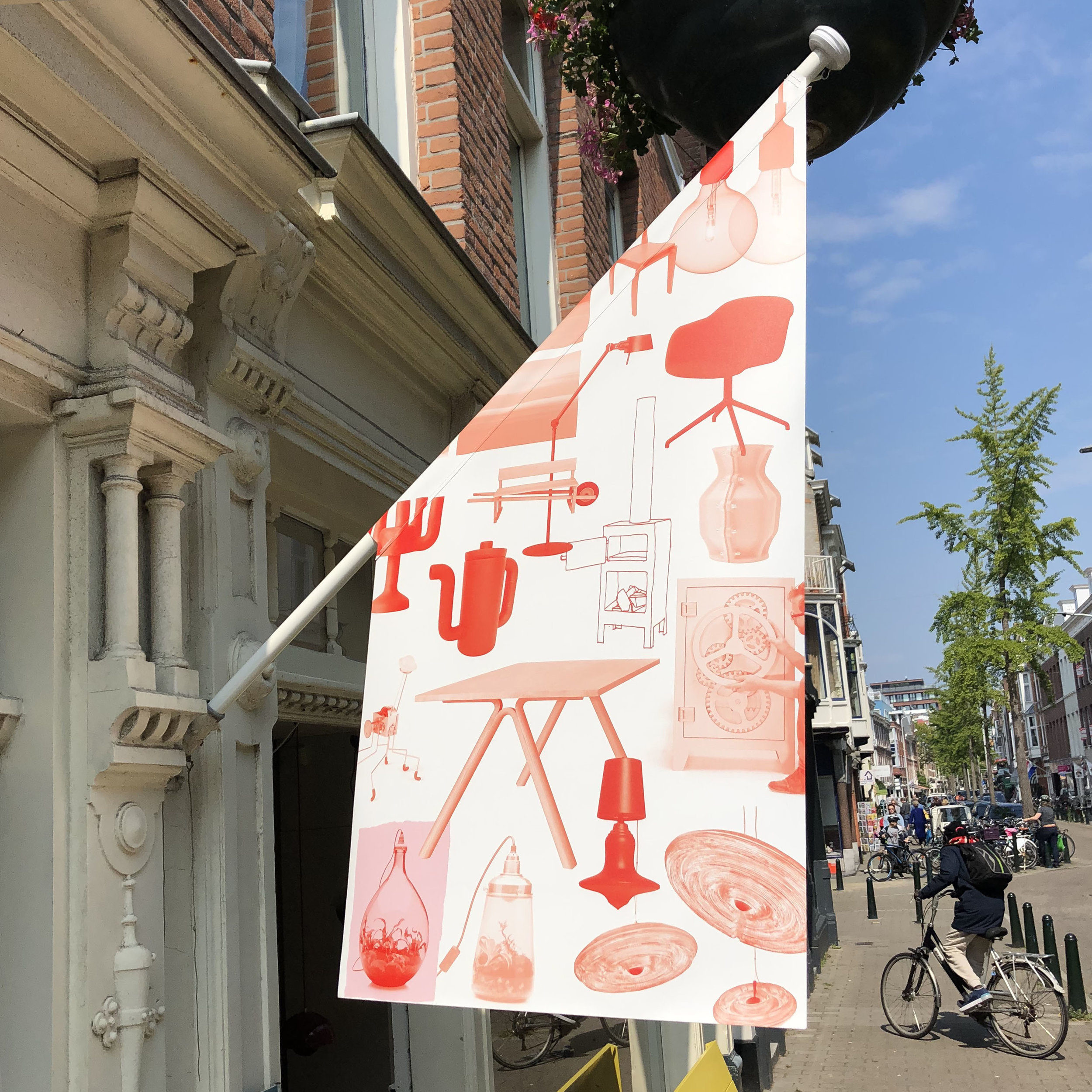
Case: Edwin Pelser
Unobvious created the visual identity for Edwin Pelser, a design shop with a strong focus on young Dutch design. We developed a logo, stationery set, newsletter, website, flyer and wrapping paper.
www.edwinpelser.nl
Case: Edwin Pelser
Unobvious created the visual identity for Edwin Pelser, a design shop with a strong focus on young Dutch design. We developed a logo, stationery set, newsletter, website, flyer and wrapping paper.
www.edwinpelser.nl
Recently we updated the wrapping paper. The new concept is double sided, therefor usable on both sides. One side is strictly visual, a collage of photo's, drawings and silhouettes. The other side is textual and tells the stories of the products as shown on the other side. Two colors are used: red and fluor red. This design is also used for new flyers and stationery set.